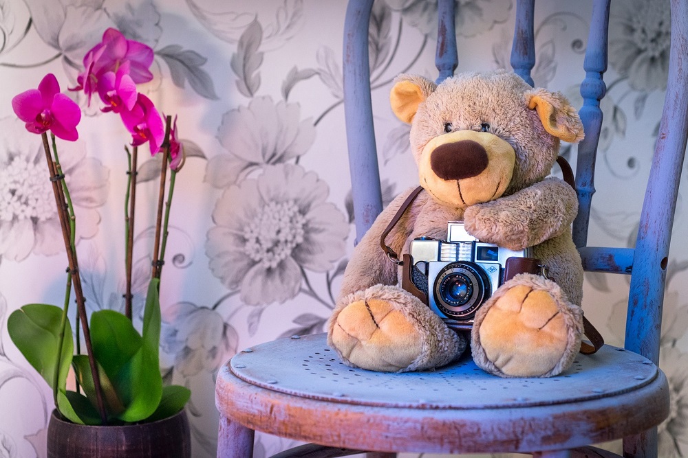
The fun thing about designing kids’ rooms is that there are fewer rules than with the rest of the home. The space needs to be safe no matter what, but other than that, you can go as eclectic and as personal as you want. Keep in mind though that kids grow up and their style changes over time. So, leave enough room to accommodate the needs of an older child.
Two color pallet
Rooms with a busy and flashy color pallet can be overstimulating for small kids and they tend to look messy and unorganized. On the other hand, a soothing and monochromatic design which is popular in modern homes isn’t really suited for kids.
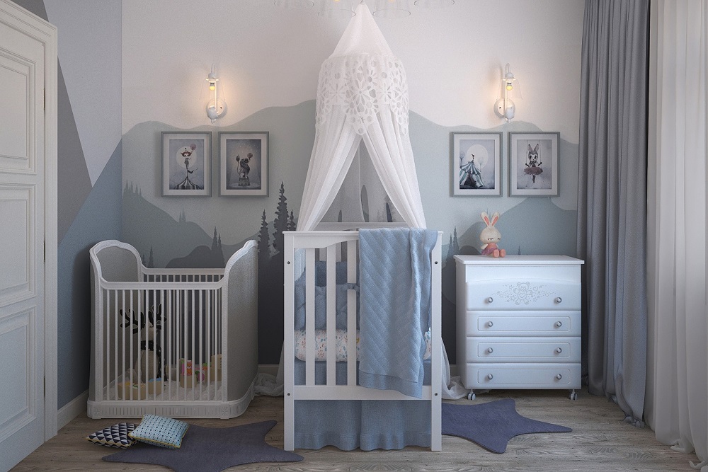
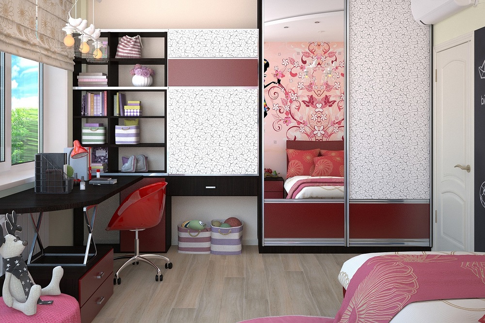
That’s why a two-color pallet option remains the best way to go. It makes the room fun and bright if you choose the right colors. And it’s overwhelming or tacky. The key is to choose the colors that complement one another and make each other pop.
A creative corner
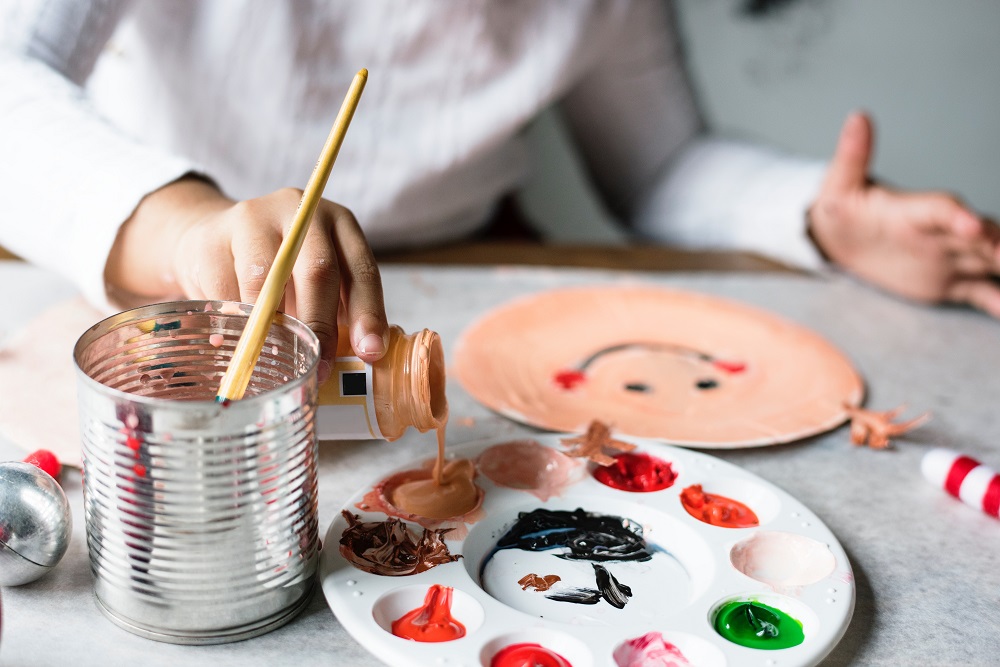
A kid’s room should be more than a place to sleep and idly spend time. The space should play a role in how your children structure their time and activities. That’s where a creative corner comes into play. Setting up such a corner will invite and inspire your children to create – draw, build, or write depending on their interest and abilities. It could be something as simple as a board and a nook for reading. The point is that there are space and material available and that kids feel familiar and comfortable with it.
Display the toys
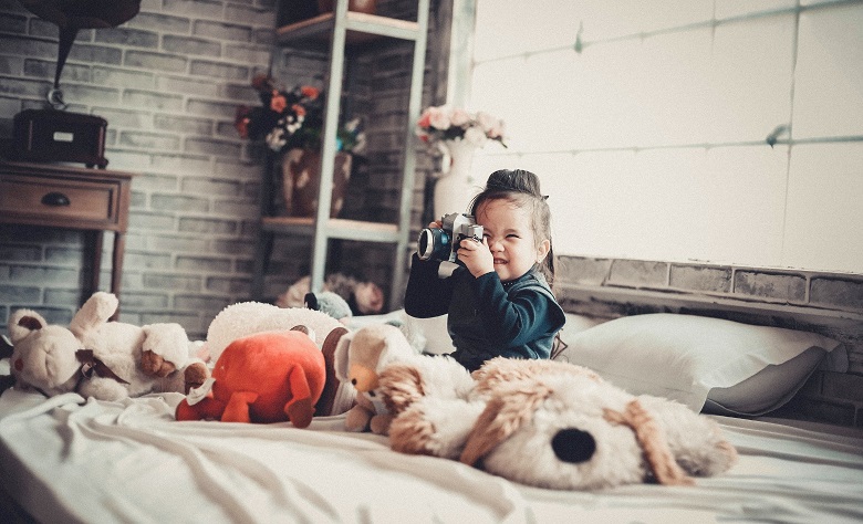
You could never expect a kid’s room to be organized and neat as you would want to, and it shouldn’t be. There’s a fun little trick that will help you make the room more colorful and less messy at once. Small Hot toys could be displayed on shelves along the walls and used as a decoration while having a clearly designated area for storage.
The toys will change as your kids’ interest does, and they go from Star Wars themed toys up to Rick and Morty dolls as your children go older. As the toys change, so will the design of the room.
Geometry as design
It may be difficult to choose the design and the decorations for a kid’s room if you plan for them to use it for years. Their interest and aesthetic may change and all of a sudden, they may be using a room of a much younger child that no longer suits them.
One of the ways of avoiding this problem is to use geometric shapes as a basis of your design. This can be done with the choice of furniture as well as the decoration choice. It also gives you the chance to mix and match more than any other design.
Wallpapers
Using wallpapers instead of simply painting the walls is probably a good choice for the kid’s room. It’s easier to clean up than it would be with bare walls and it allows you to change the design more often when needed.
There are also modern, creative options you could experiment with, by installing wallpapers that the kids can draw and write on. This will make the room a bit more chaotic, but also more fun and inspiring.
Conclusion
Designing a kid’s room has its challenges, but it’s also one of the most creative and rewarding things you can do. The important thing is to remember that you’re designing a room for the years to come.

